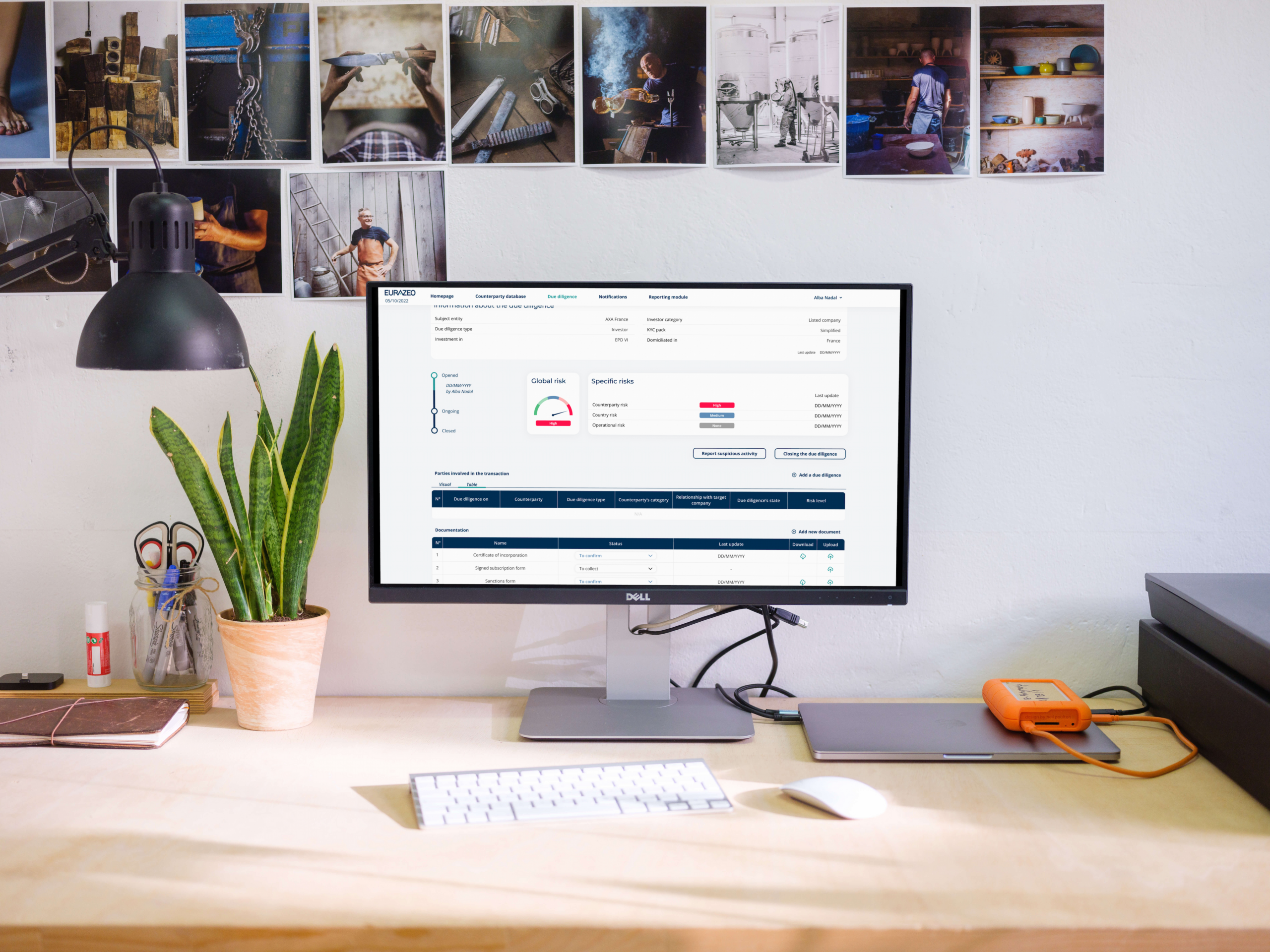
Designing a complex compliance workflow around the experts who use it.
EZ Comply – An AML/KYC decision-support platform for financial experts
Project Overview
Role: Product Designer - UX/UI Design
Duration: 1.5 years
Team: Product Manager, Product Owner, Data Scientist, Data Analysts, Front-end & Back-end Developers
Brief
Redesign an existing AML/KYC platform to improve usability, streamline investigation workflows and better support compliance analysts in their daily work.
Goal
Transform a fragmented investigation process into a structured, centralized experience, helping analysts gather information, assess risks and make informed decisions more efficiently.
Target Audience
AML/KYC analysts responsible for investigating individuals, companies and financial entities to identify potential risks.
Problem Statement
The platform had been in development for almost a year, but its interface and workflows didn't reflect the reality of AML analysts.
Information was scattered across different tools, navigation was difficult and investigations required too many repetitive actions.
The product was functional, but it wasn't designed around the people using it every day.
Initial Assumptions
The initial request focused on improving the interface and making the platform easier to navigate.
However, I identified a deeper issue: we were designing based on business assumptions rather than actual user needs.
How Might We
- How might we centralize complex information without overwhelming analysts?
- How might we streamline investigation workflows and reduce repetitive tasks?
- How might we support risk assessment while keeping human expertise at the center of every decision?
Understanding the Real Workflow
I pushed for direct collaboration with AML analysts to understand how they actually performed their investigations.
Through workshops and workflow observations with three analysts, I explored their daily routines, the tools they relied on and the difficulties they encountered.
Key Findings
- Fragmented information: Analysts constantly switched between external databases, websites and documents.
- Repetitive tasks: Gathering and consolidating information consumed valuable time.
- Complex investigations: Understanding relationships between individuals and companies required navigating multiple sources.
- Lack of workflow continuity: The platform didn't reflect the natural progression of an investigation.
Key Insight
The challenge wasn't about displaying more information. It was about making complex information easier to understand, connect and act upon.
Rethinking the Experience
Based on the research findings, I worked on restructuring the platform around the actual investigation workflow.
Rather than adding more features to an already complex product, the focus was on creating a more coherent experience across its main functionalities.
Information Architecture & Workflows
I reworked the navigation and information hierarchy to create clearer connections between the different stages of an investigation.
The main areas included:
- Parties Database: Centralizing information about individuals and companies.
- Due Diligence: Supporting the investigation and assessment of potential risks.
- Notifications: Making relevant updates and alerts easier to identify.
- Reporting: Structuring investigation findings and documentation.
UI Design
The existing interface felt dark, dense and visually overwhelming.
I redesigned the visual language with a brighter, calmer interface, clearer information hierarchy and more consistent components.
The objective was to reduce cognitive load without oversimplifying the underlying complexity.
Automation & Human Validation
Automation was introduced to reduce repetitive tasks and help analysts process information more efficiently.
Risk scores could assist the assessment process, but analysts remained responsible for validating information and making final decisions.
A Platform Built Around Its Users
The redesigned platform brought investigation workflows into a more structured and centralized environment.
Information became easier to navigate, repetitive tasks were reduced and analysts could focus more of their time on actual risk assessment.
After several weeks of use, analysts reported being able to process significantly more cases than before.
I no longer have access to precise performance metrics, but the strongest validation was clear: the analysts had adopted the new platform as part of their daily work.
The Real Achievement
The project went beyond an interface redesign.
It changed how we approached product decisions, moving from assumptions to direct user collaboration.
The result was a product that better supported the people it was designed for.
Designing for Experts Requires Understanding Their Expertise
This project reinforced one of my strongest beliefs as a Product Designer: you cannot design an effective tool for specialists without understanding how they work.
Three things stayed with me:
The Real Achievement
The project went beyond an interface redesign.
It changed how we approached product decisions, moving from assumptions to direct user collaboration.
The result was a product that better supported the people it was designed for.
- Challenge assumptions: The initial problem isn't always the real problem.
- Observe before designing: Real workflows reveal needs that stakeholders alone cannot always identify.
- Support, don't replace: Automation should empower human expertise, not remove it.
The most meaningful outcome wasn't a redesigned interface. It was building a product that people actually wanted to use.